My FIRST EVER paid illustration gig
...and some time saving tips for your next illustration project.
My time saving tips for your next illustration project:
-red pencil and separate photoshop layers for your next colour rough
Read on to find out how these tips save my bottom when Warner music wanted a single cover designed (with a three day deadline!)
I’ve been following my own illustration curriculum for three years. And, just like a real degree course, at the end of those three years I’ve graduated to a paid illustration gig.
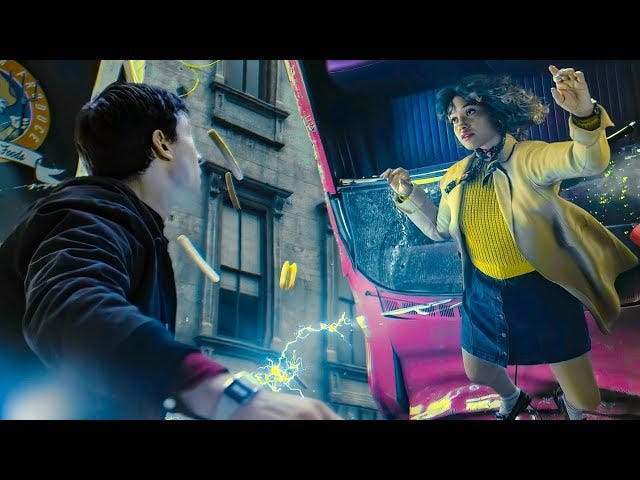
Like many first jobs, a lucky card played a big role. The ace in my pack, is my talented singer-songer writer friend Rose Betts. She’s famous for being the siren voice in the Justice League film when the Flash saves the hottie from face-planting a zebra crossing.
I was very much hoping I wouldn’t end up metaphorically face-planting a zebra crossing, when Rose Betts called me up to say she wanted me to design the artwork for her latest single. In a week. I got to work.
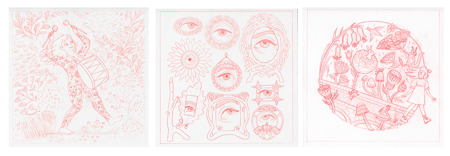
The single, Irish Eyes, already a viral hit, is all about Rose’s Irish heritage, so I wanted the artwork to reflect that. I spent two days producing these Celtic themed roughs:
Why red pencil? It’s a tip I picked up from a podcast with David Roberts… erasable red pencil sketch then black graphite when you’re confident with the design. For traditional artist this tip is such a time saver! No more squinting to see your rough, scribbly lines with the lightbox setting squeezed to max!
Rose decided to go with option three but requested some changes to her character and some of the animals. The revised options:
Design approved, I created a rough colour options in photoshop. I used a technique I learnt from Melissa Castrillón’s Domestika course; use three colours - a very dark colour, a very bright colour and a washed out colour. This makes sure you have a wide range of values (very dark through to very light ) and none of the colours are in competition. Using a seperate layer in photoshop for each colour is my second time saving tip. You can quickly change the colour of each layer using the ‘colour overlay’ fx option to come up with lots of different colour combinations:
Even with all my time saving techniques, there was one day left to produce the final artwork. Each colour was a seperate pencil layer and then stitched them together in photoshop to create a vintage screen print effect.
Thanks for coming on this journey with me! Click the picture above to hear or pre-save the the single. Let me know if you found any of the links or tips useful. And look out for the album art work coming soon!


Congratulations! Love seeing the process of how this came together.